Also see: NFL's Logos of Yesteryear (Part 1)
Again, all of these logos are courtesy of the great SportsLogos.net, run by Chris Creamer. He's the foremost authority on sports logos. Check him out.
New York Jets Alternate, 2002-2005
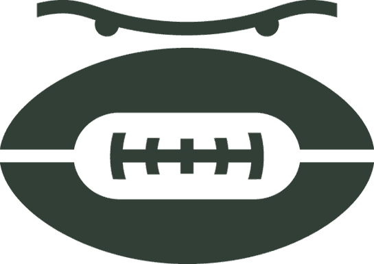
This logo would work well as a Rorschach test. What do you see above the football? The wings and engines of a plane? A portion of a bird? The eyes of an unmerciful God? If they're eyes, is the football a mouth?
Pittsburgh Steelers, 1954-1959 alternate

Well, this seems like a terribly dangerous and impractical use for a football. I want this man to stay alive. He is obviously cheerful and his figure suggests he lives well. As they apparently used this logo until 1959, I kind of hope they never bothered to change the year on the flag.
San Francisco 49ers, 1946-1967

Of course, up until the 1980s or so, there were a plenty of silly gun-toting logos, but this might be my favorite. The trope of celebrating by shooting into the air is one thing, but can a historian tell me if shooting INTO THE FLOOR ever was? This was the Niners primary logo for 21 years. Also: check out those pants.
Seattle Seahawks, 1976-2001

In 2002, they essentially "cleaned up" this logo. They needed to. That eye. Who thought that eye was a good idea? He looks either very old, very stoned, very sleepy, or very tired of life.
Washington Redskins alternate, 1960-1965

Ay yi yi. Even people who think political correctness is ruining the country say, "Yeah, that's too much." Plus, their colors, then as now, were burgundy and gold, so I'm not sure what's up with all the blue.
Pittsburgh Pirates, 1933-1939

Yes, there was a Pittsburgh Pirates in the league in the '30s. And when you think "pirates," you undoubtedly think of the heraldic crest of someone minor European fiefdom, as this logo illustrates.
That seems to be all of the NFL logos I have opinions on, so let's have a couple of looks at the CFL.
Edmonton Eskimos, 1996-1997

Speaking of political correctness, if SportsLogos.net is to be believed, Edmonton has had the sense to never use an Eskimo figure in their logo. This one only lasted two years, so it must have been quite unpopular. I, however, am feeling it.
Winnipeg Blue Bombers, 1995-2004

Many moons ago, a Canadian regular in the Sports Central Message Boards created a "best sports logo" poll and contest, and if memory serves, this was your winner. So, of course, Winnipeg dispensed of it in 2011 to give us a boring ol' block W.
Leave a Comment